What Should a Book Cover Do?
On the Design Origins of Catherine Lacey’s ‘Nobody is Ever Missing’
The cover of a book is at work long after it catches a reader’s eye from a shelf. It’s at work when she puts it down on her bedside table, or stands holding it on a crowded subway car. It extends the story after she turns the last page: I can’t count how many times I’ve come to the end of a book I wished would never end, and stared at the cover art as if that was where I’d find more.
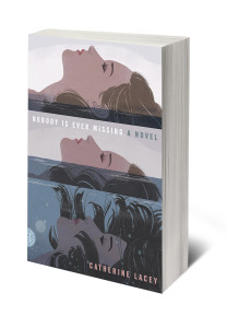
What exactly is this work that a book cover does? When it does the work well, how can we not judge the inside by the outside, at least a little? I asked Charlotte Strick, who designed the cover for Catherine Lacey’s debut novel Nobody is Ever Missing, how she created a container that so carefully echoed the depth of its content. The cover features an illustration of a woman slowly sinking into water over three panels. “As a reader you rarely want to know what that person looked like,” Strick said, “You want to imagine her in your own way. Illustration is a great way of creating that separation. This woman could be your friend, the person you imagined in your head, or she could be yourself.”

Nobody is Ever Missing is the story of Elyria, a woman who abruptly leaves her life in New York and takes a one-way flight to New Zealand. The novel doesn’t reveal a specific trigger that lead to her leaving, but we begin to understand her deep disquiet as she guides us through memories of a haunting family tragedy, and a complicated marriage. She is trying to get away from herself, or the self she sees reflected in others, not just to reinvent but to perhaps seek an absence of self altogether. She professes, “I’d still like, some mornings, to be the thing running far from me, instead of sewn inside myself forever.”
Strick spent 14 years as the Art Director for the book’s publisher, Farrar, Straus and Giroux. She has been the Art Editor for The Paris Review for the past five years, and recently started her own design firm, Strick&Williams. Her covers have included literary hits such as Jonathan Franzen’s Freedom, Roberto Bolano’s 2666, and Rachel Kushner’s The Flamethrowers. Strick is great at what she does in part because she’s such an enthusiastic reader. “Even if I have an idea on page 50 of how to solve the cover design, I need to know how it ends,” she told me in her kitchen in Williamsburg. “I never feel like it’s fair to the book to make a decision about what the cover feels like or what the jacket looks like until I finish the story.”
Her first ideas for the cover came early in the reading. “I knew how original the writing was from the start. It was very layered, and I knew that I had to come up with a way to suggest the unraveling of this woman.” Strick jotted down “stingray” when early in the novel Elyria looks down from a ferryboat and sees a stingray bleeding on the surface of the water. She copied the entire excerpt into her own notebook:
I knew that stingray had been chewed by something because that is all the ocean is—a big hole full of things chewing each other—and it’s odd that people go to the beach and stare at the waving water and feel relaxed because what they are looking at is just the blue curtain over a wild violence, lives eating lives, the unstoppable chew, and I wondered if any of those vacationing people feel all the blood rushing under the surface, and I wondered if the fleshy, dying underside of the ocean is what they’re really after as they stare—that ferocious pulse under all things placid.
This excerpt marks the end of a chapter, and I imagine that this is a good place to pause. With Lacey’s writing lingering on a reader’s mind, the cover has a chance to participate: Here is a visible hint at that “wild violence.” Here is a suggestion of the “blue curtain” itself, with a woman submerged under it. In the most successful instances of text and image interacting, the image is not an illustration of the content, but a way to assist in the savoring of something, of helping to hold onto the language. A good cover doesn’t tell a reader how to see something, but extends the content into the tangible world. As Strick continued to read, her notes narrowed in on water and images of sinking. “[Elyria] has this loss and this inner violence that she doesn’t know where to put,” Strick said. “Obviously that’s why she has to go on this journey, and she doesn’t attach herself to anybody. As a reader you’re sort of begging her, ‘please find a life jacket.’”

Life continued around Strick’s reading. She paused, put the book down momentarily, and the image that ultimately inspired the cover came from researching another. An illustration by an unknown artist that had a Roy Lichtenstein quality popped up in some Internet-search-rabbit-hole. It showed a woman with her head back, crying in three horizontal panels. The image stayed with Strick, but she had trouble finding it anywhere again. Still, the idea was in place. (In a more recent search while putting together this story, we found that the image was an alteration of a vintage Marvel comic strip. The original version uses vertical panels instead, with “…It’s… all… over!” in dramatic red letters above the woman. Strick commented that she might have simply passed over it, had she only seen the image in its original form.)
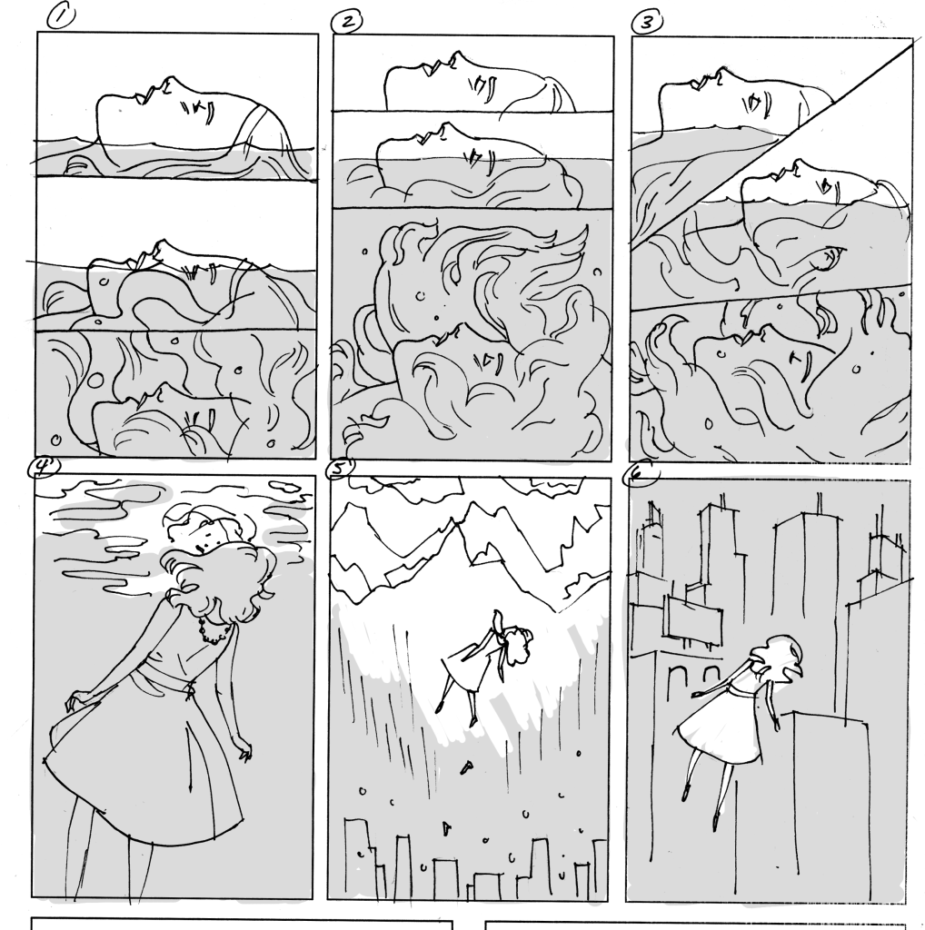
Questions came up as she worked: she wondered whether the woman’s face should change from panel to panel. Strick never intended for her to be crying, as in the Marvel image. Should the woman be aware of herself sinking? Should she look alarmed or surprised in the third panel? Should it be a conscious choice to plunge?
FSG’s creative director referred Strick to illustrator Patrick Leger, who had worked on a book jacket for FSG the year before. She says it was Leger’s color pallet that assured her he would know how to capture Elyria’s descent. “I think a cover should be able to convey the tone of a book,” Leger said in an email. “A lot of publishers want every story element of a book on the cover, but I think it works better when it invites a reader to make a tonal connection. The text of the book expands on that initial expectation.” He sent Strick a sketch of a woman in three panels, along with a few alternatives: Elyria floating away from a city landscape towards mountains, another under her own reflection, and another under a night sky. “These weren’t really that conceptually different from Charlotte’s initial idea for the cover, but they gave her more perspectives to consider,” he said.

Lacey was thrilled with the design. “I feel like I owe Patrick and Charlotte my first born,” she told me in an email. Later, over coffee, she explained that because Nobody is Ever Missing began as separate, short pieces, she hadn’t imagined what her dream cover design might look like. “Fortunately I think FSG nails it when it comes to designing books, so I neither feared the sexy/pink/cake/woman cover nor did I have an ideal cover in mind,” she said. “I think I had pictured the cover being more bold or manic before there was one, but this was so much better. It’s not afraid to be soft. There is a sense in the book of the narrator being slowly swallowed by her unconscious mind and the illustration captures that in a subtle, beautiful way. The sequence of it almost creates a loop. It asks you to keep looking.”
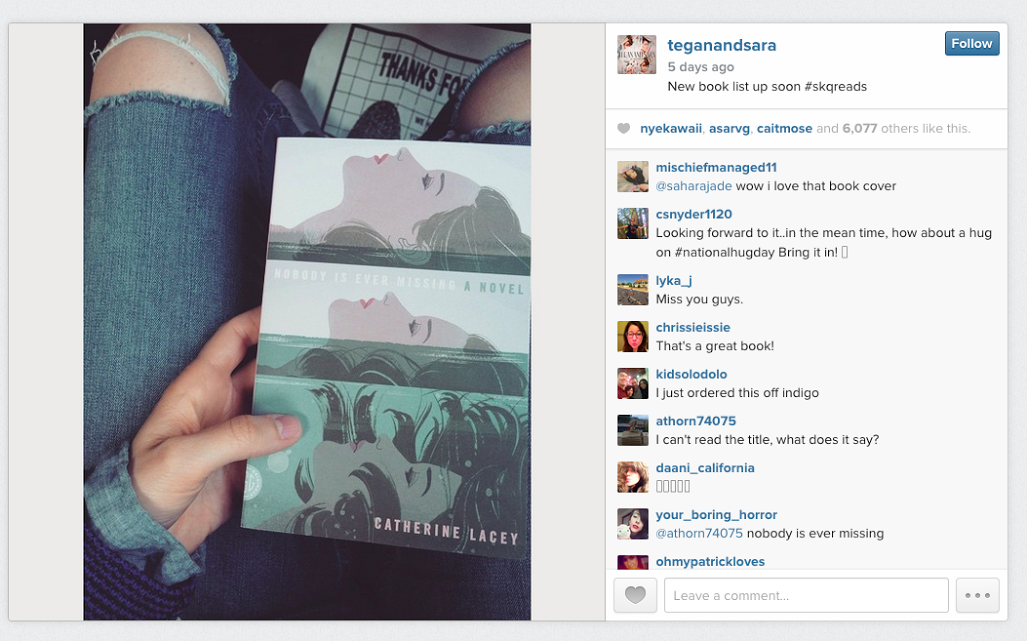
Nobody is Ever Missing was met with abundant critical praise: The New York Times called Lacey’s sentences “improbably beautiful,” comparing the debut to Renata Adler’s Speedboat and Joan Didion’s Play it As it Lays. Vanity Fair called it the lyrical, more literary version of Gillian Flynn’s Gone Girl. Alternative points of praise showed up on social media: not separate from the book itself, it seemed that the cover too, was garnering attention. Director Joss Whedon posted a photo of the cover on Twitter writing, “I have no words. Catherine Lacey took all the words and put them in here and now I feel less and more alone. Awe.” Musical duo Tegan and Sara’s Instagram of the book against someone’s blue-jean clad lap received over 6,000 likes. These more brief points of praise make me wonder what’s behind the choices we make when we share a book—why post the cover, rather than a favorite quote, for example? As for the attention, could 6,000 likes from Tegan and Sara fans also mean 6,000 new readers?

Of course, both Josh Whedon and Tegan and Sara were readers who shared the image because they loved the novel itself, and perhaps they would have shared it even without this particular cover. Still, it’s worth noting that the visual appeal of the cover encouraged the spread of such mentions. I asked Lacey what she thought of this impulse to share a book cover on social media: “It’s a way of bringing somebody into the privacy of your reading experience,” she said. “But the book does become kind of an accessory doesn’t it? Maybe they share it because it looks good or they want to be associated with it. Does that mean they’re not engaging with it? As the writer you’re invited to ask that question.”
Every so often, Strick said, she’ll see a stranger on the subway holding a book whose jacket she designed, and she’ll slyly take a picture. “It’ll just make me smile that this thing I labored over that kept me up until three in the morning, that I thought was never going to be approved, is now out in the world.” These sightings fit seamlessly into her goals for what her covers should do. “My hope is to make beautiful objects. I also want them to have conceptual meaning as they interact with the text.” With the growing popularity of e-books, I wonder what will happen to these subway-book-cover-sightings, and how much we might lose of these visual objects. Will the digital age kill the book jacket like it did the album cover? On the subway, instead of book jackets we’d only see each other’s Kindle cases.
Leger is optimistic, and noted that even if we’re not reading physical books, the cover art has many opportunities for appearances. “I think the association between a book’s cover and it’s content is probably more important now in the digital age than it ever has been in the past,” he said. “As the Internet becomes more visual, a book’s cover will be what stands out, whether it’s on social media like Instagram or the ‘Also Suggested’ list on Amazon.”
Many dedicated book lovers struggle with the idea of e-books, and I think that often the conversation seems to abruptly come to a halt when someone says, “I would miss holding a book in my hands.” Everyone nods emphatically, and I agree, but I wonder if we’re being too stubborn. I like turning physical pages, and I like having the option to throw a book across a room. I like smelling the new book smell, and I like to be able to close a book and savor the content with its cover art. But do these changing modes for reading make way for a less immersive experience, or just a different one? If the book-as-accessory makes a reader less engaged, maybe an e-book (with its accompanying thumbnail image) could immerse some readers even deeper into the content.
Lacey pointed out that during her own travels, books became difficult to carry and e-books, of course, would have given her more options. But despite the convenience, she might have lost some unexpected rewards that come with carrying around the same book. Lacey said this is how she came to read Evan S. Connell’s Mrs. Bridge three times—an autobiographical aspect of the novel too, as Elyria also travels with Mrs. Bridge. “I was in the middle of nowhere and that’s all I had… I also read Love in the Time of Cholera ten times, because I had to—I was in Japan and there were no books in English.”
The cover art helps to build an identity with the content, whether a reader treasures a book as a prized possession, or allows it to fray as it accompanies her on an adventure. “When you get a project it immediately feels like your baby. I am always reminding myself that this is somebody else’s book,” Strick added. “It’s Catherine’s baby before it’s mine. It’s the editor’s baby when they take on the project, and all of us care about what’s going to happen to this book. Then as the reader it becomes yours, your baby up there on the shelf that you want to share with your friends (or on Instagram), and that you’ll never give to Goodwill. I like to think the cover art plays a role in that.”


