Another month of books, another month of book covers. We’ve entered what is arguably the most exciting season for books, and so naturally, the covers follow. Here are my favorites from September:
 Ida Vitale, tr. Sarah Pollack, Time Without Keys; design by Tyler Comrie (New Directions, September 4)
This layered, cut paper treatment is delicate and extravagant at once.
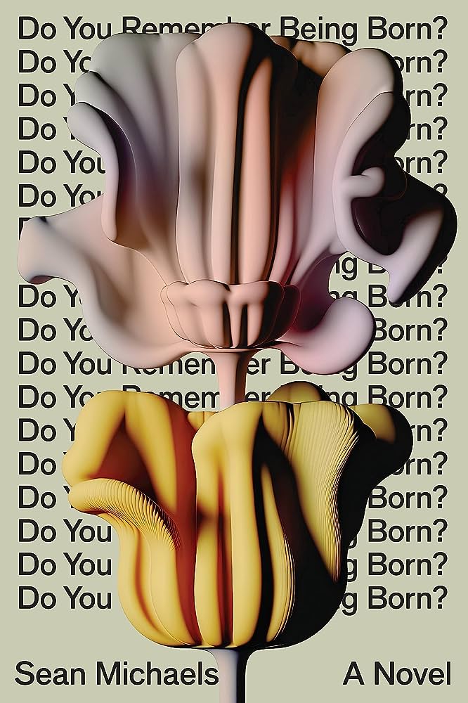 Sean Michaels, Do You Remember Being Born?; cover design by Rodrigo Corral, 3D illustration by Danny Jones (Astra House, September 5)
What to even say about this glorious, insane book cover? Sometimes, the weirder the better.
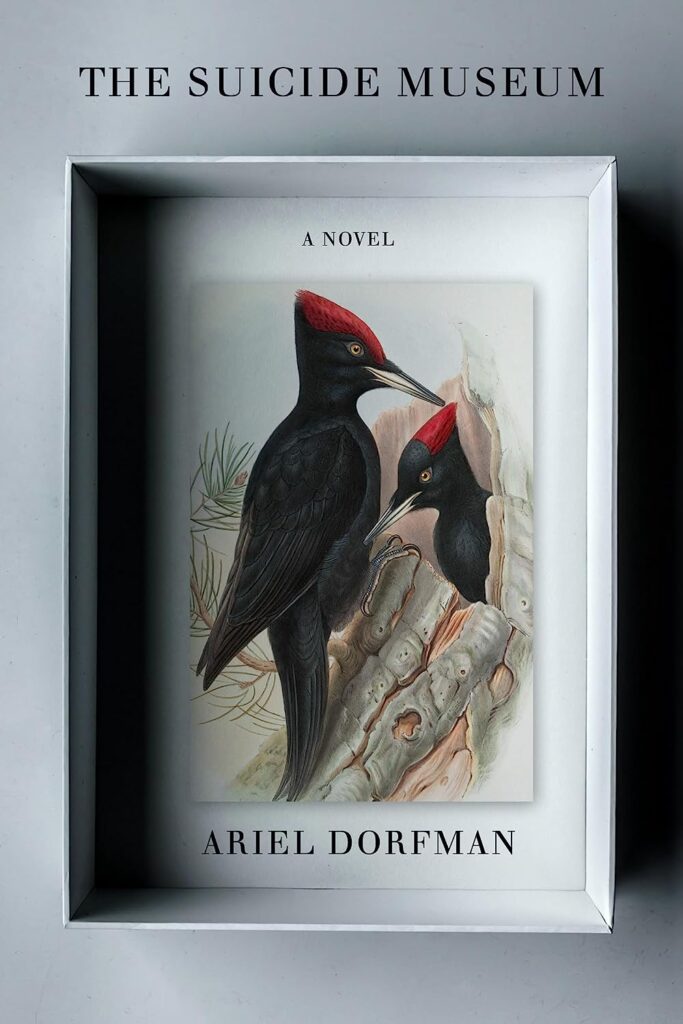 Ariel Dorfman, The Suicide Museum; cover design by John Gall Design (Other Press, September 5)
This reminds me pleasantly of those Nabokov backlist butterfly box redesigns (which John Gall art directed—gasp—fourteen years ago), but with a sleekly updated vibe.
 Anne Serre, tr. Mark Hutchinson, A Leopard-Skin Hat; cover design by Joan Wong (New Direction, September 5)
This is just a really good idea, and plus it made me smile.
 Gina Rushton, The Parenthood Dilemma; cover design by Rodrigo Corral, photo by Jason Fulford and Tamara Shopsin (Astra House, September 5)
I love the strangeness of the image, neatly paired with the cover text.
 Yiyun Li, Wednesday’s Child; cover design by Na Kim (FSG, September 5)
(In real life, it shimmers.)
 Victor Heringer, tr. James Young, The Love of Singular Men; cover design by Pablo Delcan (New Directions, September 5)
A simple, straightforward text-based cover that’s elevated by the color choices.
 J. Michael Martinez, Tarta Americana; art direction by Lynn Buckley, art by Amber Cowan (Penguin Books, September 12)
Another cover that makes excellent use of a piece of art.
 Laura Picklesimer, Kill for Love; cover design by Jaya Nicely (Unnamed Press, September 12)
A parade of pink torsos? Gotta love it.
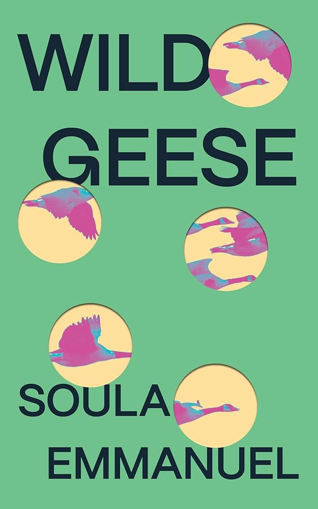 Soula Emmanuel, Wild Geese; cover design by Dana Li (Feminist Press, September 12)
Another layered cover (in a shade of green you don’t see too often on book covers).
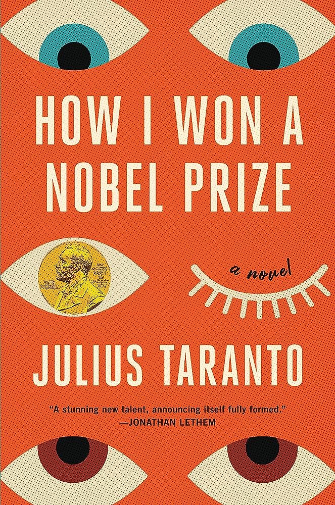 Julius Taranto, How I Won a Nobel Prize; cover design by Lucy Kim (Little Brown, September 12)
Now this one reminds me pleasantly of Peter Mendlesund’s Kafka backlist redesigns (only 12 years ago, whew). The coin makes for a very fun twist.
 Anya Johanna DeNiro, Okpsyche; cover image: “Psyche Asleep in a Landscape,” by Karl Joseph Aloys Agricola, 1837 (Small Beer Press, September 12)
It takes a few moments to see the subtle shifting in the painting, but what’s really daring is that bleeding text treatment.
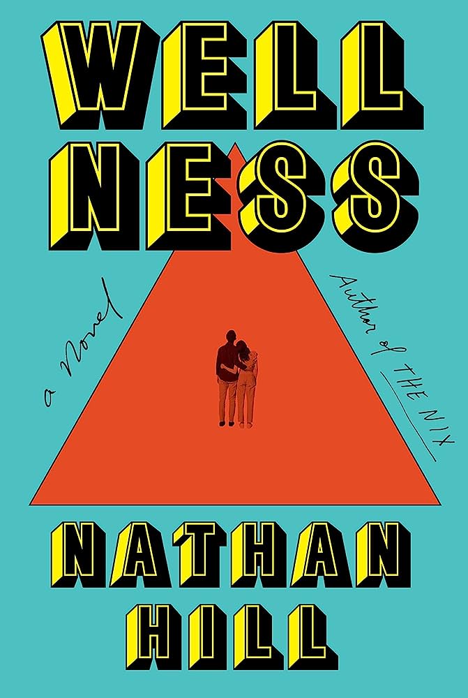 Nathan Hill, Wellness; cover design by Oliver Munday (Knopf, September 19)
Big and bold and beautiful.
 Daniel Mason, North Woods; cover design by Anna Kochman (Random House, September 19)
“There was so much imagery to be inspired by in this book, it was hard to zero in one thing!” Anna Kochman told Lit Hub. “Originally this illustration was part of a panel design, using a few different images, but it was the one that seemed to call to everyone. I think the style of illustration and the amazing expression in the eyes of the catamount really suit the tone of the book, and when we let it stand alone it felt right.” It certainly does.
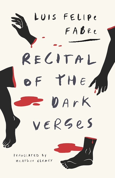 Luis Felipe Fabre, tr. Heather Cleary, Recital of the Dark Verses; cover design by Alban Fischer (Deep Vellum, September 19)
Macabre and brilliant.
 Karl Ove Knausgaard, tr. Martin Aitkin, The Wolves of Eternity; cover design by Stephanie Ross (Penguin, September 19)
This looks like a simple cover at first glance, but it’s actually playing with perspective in some really interesting ways—look for the sky behind the text, the light in the corners. Where are we?
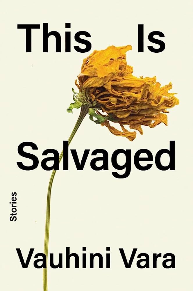 Vauhini Vara, This is Salvaged; cover design by Keith Hayes, art direction by Steve Attardo (W.W. Norton, September 26)
Behold the power of a single, dynamic image (and the text treatment to support it).
